TIP: Before starting out on creating an interactive video make sure you have uploaded the image(s) and video(s) that you want to use in your Scene(s). Allow enough time for Togotiki to encode all your video files that you will be using. Uploading files into Togotiki is done in File Library.
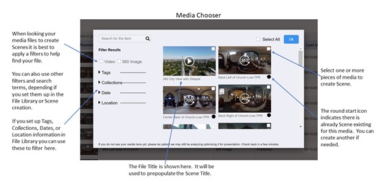
To create an interactive video, first Add (create) a new Scene and select the video you want to work with to make the Scene. The image below shows how you can find the video you want to use with the Media Chooser.